
Opening Sequence [ Opening Sequence ]
The opening sequence that brings the whole film to life
The two masters, Saul Bass and Kyle Cooper
Intro movies, opening sequences, and title sequences, which are now a major genre of motion graphic design,
have established themselves as businesses in the film industry.
Let's meet the stories of the design masters who brought the opening sequence to life to the present.
Let's start by making a big distinction first,
Soul Bass is the man who gave the life of design and justification to the opening sequence in a world of film
business without computer graphics.
Kyle Cooper is the person who pioneered and developed the current opening sequence to the point where he hinted
at the whole movie and played the role of the teaser.
What the two have in common is that they pursued minimalism that conveyed the concept clearly and simply.
The means is that kinetic typography is used.
minimalism [minimalism]
It appeared in the field of visual arts before and after World War II and expanded to various fields such as music,
architecture, fashion, and philosophy, and it is appearing in various forms. In English, the term minimalism,
which combines 'minimal' meaning 'minimum, minimal, minimal' and 'ism' meaning 'attention', has been used
since the 1960s.
Minimalism is basically based on the belief that when artistic technique or adaptation is minimized and only the
fundamental, that is, the essence of an object is expressed, the gap between reality and the work is minimized and
real reality is achieved.
kinetic typography
The word kinetic is derived from the Greek word 'kinesis', which means movement, and has the meaning of 'movement' or 'by movement'. If interpreted easily, it can be interpreted as 'the typography (letter) has dynamic movement'. In other words, it is also called 'moving text'.
It is conveyed through the size, beat, rhythm, speed, and transformation of the font on the screen. This simple design element is very impactful and it is an expression method that can convey many plots and stories. It is not an exaggeration to say that most of the initial start-up phase of the current motion graphic design has been lost in ginematic typography.
Soul Bass [ Saul Bass, 1920~1996 ]
American graphic designer
Minimalism dominates the design world of Soul Bath.

He studied design in New York and worked as a freelance designer before moving to California in 1946 to open his own studio. He transplanted the New York-style sensibility to LA, the mecca of movies, and naturally came to design related to movies.
He is a designer who shined with genius direction and ideas with collage and drawing graphics in the days when computer graphics did not exist yet.
Designers who studied and practiced design in the 20th century will know that the design they have seen countless times in reference books such as 'American showcase' and 'Workbook' is the influence of Soul Bath.
In particular, when he moved to California and established a design studio, he naturally started working in the film industry.
And he pioneered the genre of opening sequence with new design techniques and ideas.
Numerous Hollywood film directors, who have recognized Soul Bath's design skills, begin to ask him for all the logos, title sequences, concept graphics, posters, and promotional graphics for the movie to be produced. Furthermore, the role has been expanded to include film editors and producers.
However, the vision of filmmakers, who had stopped at the level of signs and posters of theaters, continued to the screen in the movie, and pioneered the era of showing the philosophy conveyed by graphics.
Soul Bath's design philosophy
“Design Is Thinking Made Visual”
Design is thinking and visualizing.

Let's appreciate the graphics of the design philosophy pursued by Soul Bath.

Soul Bass, a work that divides the history of poster graphic before and after, does not stop with this poster, and uses his crooked arm as an identity to advance into many promotional materials and movies, even the opening sequence. It is not just an outstanding development in terms of design, but it is a big issue that has influenced and awakened the industry itself by combining the design and graphics of the film industry.
[The Man with the Golden Arm] is a movie depicting the process of drug addict and gambler Frankie Machine (as FrankSinatra) overcoming drugs with the power of love. He is nicknamed 'The Man with the Golden Arm' because of his outstanding skills at the gambling house. It's a fast and skillful arm, but it's also a drug-injected arm.
Based on this story, Sol Bass used the crooked arm as the graphic identity of the movie and applied it to posters, title sequences, and various promotional materials. The faces of the main actors are not shown in the poster, only written letters. Also in very small print. The poster, which is simply designed with crooked arms and large sides as graphic elements, is inconspicuous but also contains the name of the designer, Sol Bass. Almost all movie posters in Hollywood were designed anonymously, so this was also a big change. The title sequence is designed so that the actors and staff names are listed as the bar-shaped graphic elements move. It was also the first time Sol Bass introduced movement to a movie title with such graphic elements. This radical change occurred almost 50 years after the film was released. Other than that, the movie poster was outdated.
'Anatomy of Murder', the culmination of Soul Bath's philosophy following the man with golden arms
Soul Bath further developed another film directed by Otto Preminger, who intuited the abilities of Soul Bath. Compared to his previous work, he was more daring and began to melt his identity into everything in marketing and publicity.
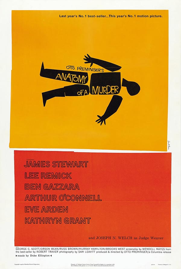
[Anatomy of Murder] is a movie that uncovers the truth of a murder case involving James Stewart as a clever lawyer. Sol Bass designs human body symbols with silhouettes based on the title ‘Anatomy of Murder’. This symbol was also applied to the cover of the script, which is an internal document, and was applied in turn to press release documents, title sequences, posters, and various promotional materials. In the title sequence, this black human body symbol is disassembled into the head, legs, arms, and torso, respectively, and it is designed as a video in which information is displayed.
These are poster designs that Soul Bath participated.
The concept, which is the philosophy of Soul Bath, is clearly and simply, and the minimalism that suggests the props and plot of the movie is all melted.

The insight from the above data is a very important factor in the success of the movie, the actor's name is very small or invisible. The most important cause is expressed graphically by condensing the delivery of the film that the director wanted to express and the artistry that the writer wanted to express. In the past, the film industry must have been important in terms of investment and box office performance, and this is a predictable part of how much impact such an attempt will have on the industry front. Soul Bass and director Otto Preminger, who made the film's production so endowed with the artist's soul, are a great reason.
It's my guess, but I think it's probably the '007 series' that we often come across with a professional title sequence and opening that are perceived by this intense color and motif. Rather than expressing the symbolic overall concept like the above works of Soul Bath, it is judged that it was improved by focusing on the hero setting of 'James Bond 007' and the character of a 'spy movie'.
There is a video that summarizes the opening sequence of Soul Bath, so let's take a look.
This is a work that introduces the motif of an anatomical work of murder in Soul Bath's 2004 exhibition.

There are a lot of graphics, designs, and opening sequences, but you can find good materials on YouTube and Naver, so I'll just skip this one.
Designers compromise with reality. When thinking about commercial returns, they exchange time and talent, or exchange sense (quality) and money. Numerous design companies, designer freelancers, and even design automation these days... It can be seen as an ecosystem that competes fiercely.
Advertising, architecture, web, application, broadcasting, video, and interior design all have the same essence.
When I was studying design, the first moment I became a professional designer, I must have made the decision to 'I will not exchange my talents with time'. "I will not conflict with an output without soul that does not put life into it!" Easy to say, not easy to implement. Now I have to work and make a living...
The reason design pioneers in the past are great is overcoming them.
I try to console myself by saying that the competition wasn't fierce back then, but when I think about it, there was nothing at that time.